
Redefining air travel with Air India app

Proposed state
Current state
Duration :
3 weeks
Team :
Anurag Sharma
Vivek Kanaujia
Client :
Air India
(Hypothetical)
Role :
UX Research
UI Redesign
Prototyping
Usability testing
Project Background
Challenge
Air India is the oldest and most reputable name in Indian air travel. In terms of domestic market share, it is India's third largest airline. It was recently acquired by the Tata group, which originally established the airlines in 1932.
However, the current state of its official mobile booking platform is not very encouraging and it requires a complete redesign to compete with rival airlines and third-party booking platforms that are far ahead of Air India in terms of their usability and features.
Scope
- To solve usability issues with the ticket booking process in Air India's existing mobile app.
- To improve Air India's customer service through their mobile app.
What does users say?
Upon Investigating on the play store, it was observed that majority of the customers were struggling with the app and had provided multiple bad reviews and very low rating for the app.
Following were the most common issues as per the user feedback :
- Confusing UI
- Cannot export boarding pass
- Issues in app- check in
- No login system
- No wheelchair assistance
.png)
Research plan
We started with laying down a framework for our research work to guide us as we proceed. We listed our, Research goals and methodologies for the research.
Research Goals
- Understand Air India’s existing market position and growth strategy.
- Identify the primary user groups.
- Learn about which features/ services competitors are providing.
- How the users interact with the existing app.
- What are the users pain points with the existing app.
Methodology
- Secondary Research (Analysis of the existing app, Market Research, Competitive Analysis)
- Primary Research (User survey, Usability testing of existing app, User Interview)
Secondary research
Analyzing the current platform
First step in the research process was to analyze the current user flow for ticket booking in Air .
Objective of this exercise was to identify the visual issues which might create confusion in users.
Key issues
- Cluttered visual language.
- Bad information hierarchy in the placement of tasks.
- Repetitive screens on multiple steps.
- Users don't have control over the booking process.
- No visual consistency.
- No information regarding the steps in the booking process.
- Too much information on each screen increases cognitive load.


Market research
To gain better perspective on aviation industry we conducted a market research. Our focus was to understand Air India’s market share & its growth strategy and common challenges faced by airlines.
Following are the insights drawn from the official reports of DGCA (Directorate General of Civil Aviation, India).
Target groups
Nearly 53 % of air passengers is estimated to be the tech-driven millennial. This figure is expected to go up to more than 60 percent in the next 10 years. (source : The daily star)
Insight - Air India's primary target audience is millennial (26–41yrs), with gen-z (10–25yrs) as a potential audience in near future.
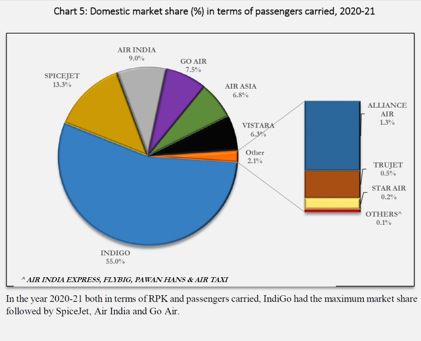
Competitors
Indigo has the maximum share in domestic market followed by spice jet & air India.
(source: DGCA report, may22)
Insight - Indigo and spice jet are the main competitors of air India in domestic market.
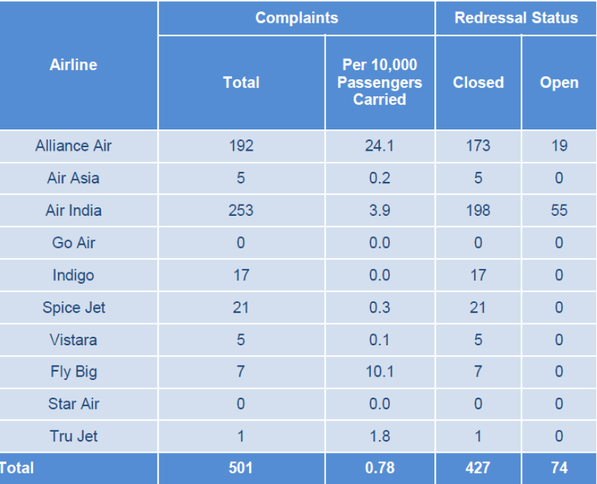
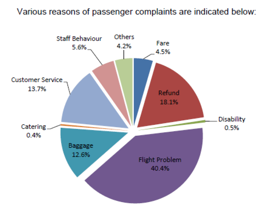
Monthly complaints
Air India had received maximum no of complaints in the last five months (jan22 - may22). (source: DGCA report, may22)
Insight - flight problems like (delayed flight, Issues during check in, boarding denial), baggage issues, refund process and better customer support might be our focus areas.
Competitive analysis
Based on the insights of market survey we selected direct and indirect competitors of Air India for a competitive analysis .
Our aim was to compare the official booking apps of the respective airlines and identify their strengths and weaknesses. These insights may help us identify any gaps in features that our solution might address.

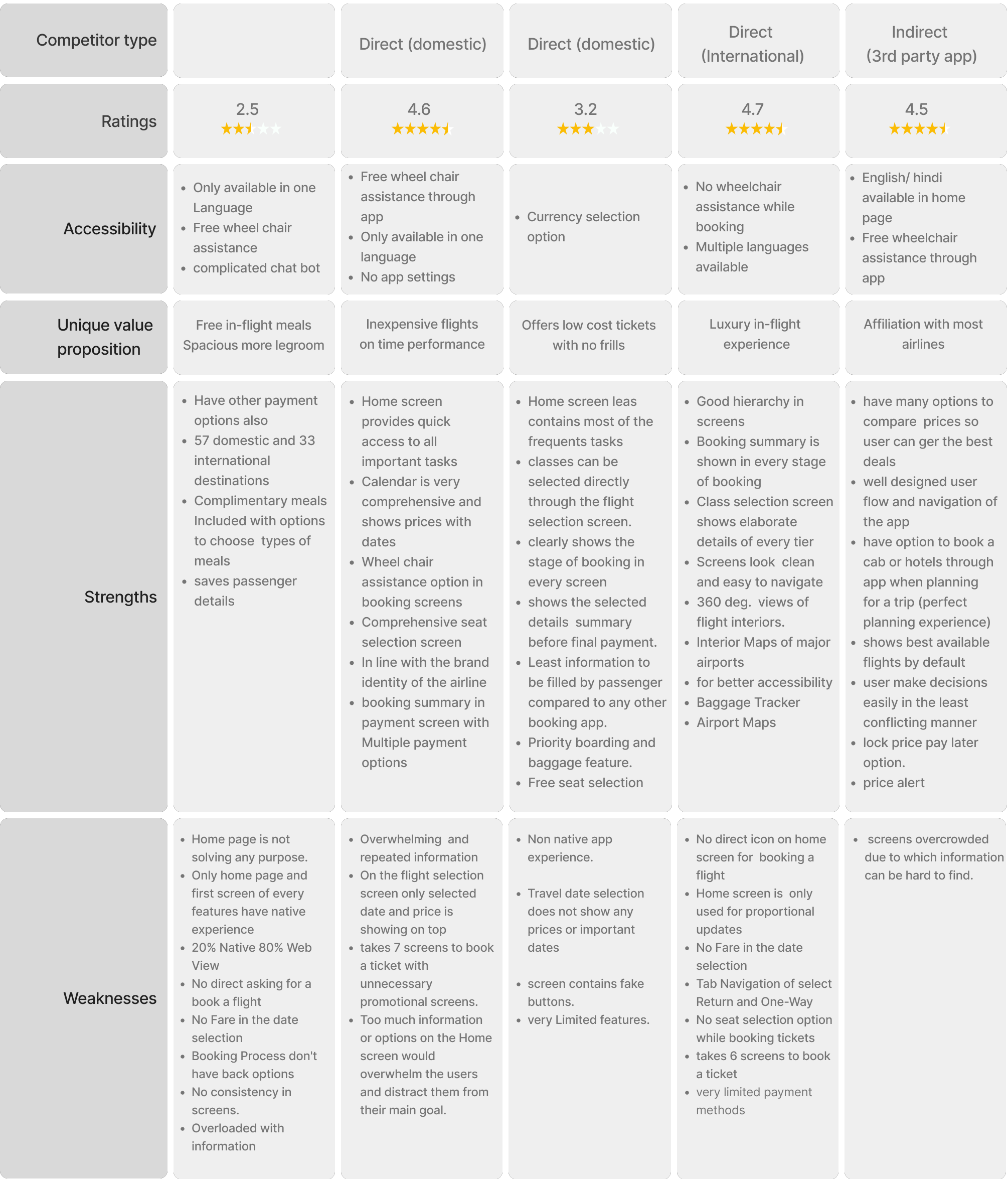
Insights
Borrow it
- Lock price pay later option.
- Price hike alert.
- Priority passenger feature
- Airport maps & navigation360 deg. views of flight interiors.
- Options to compare prices so user can get the best deals
- Displaying best available flights by default
Improve it
- Can improve trip planning experience with a more comprehensive calendar.
- Minimizing the flight booking process form planning to payment.
- Improve on flight search and filters.
- Can add features that provides assistance throughout the journey.
Avoid it
- No way to go back on previous step in the booking user flow.
- Promotional popups breaking user flow.
- Non-native screens which leads to websites.
- Additional/ hidden charges discovered in final payment.
Primary research
User survey
Based on the learning of secondary research we prepared a questionnaire and conducted an open survey through google forms, to gain direct insights on user preferences.
We collected responses form 53 participants which helped us in creating provisional personas representing the potential users.
(See all responses)
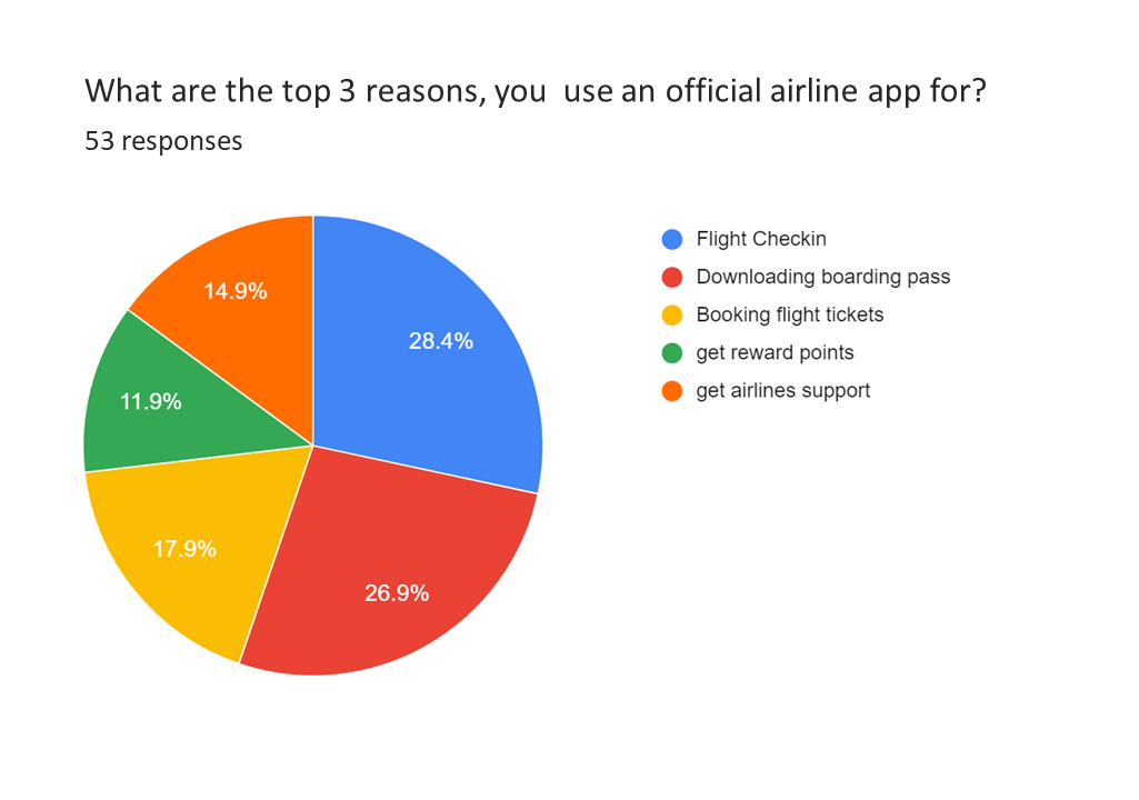
App usage scenarios
Flight Check-in and downloading boarding pass are the major actions for which users prefer official mobile application.
Insight: Users Install official apps for specified micro tasks which are not possible with 3rd party platforms.
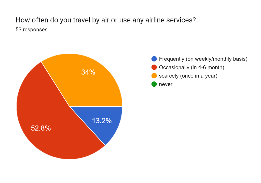
Travel frequency
It was observed Most of the travelers are occasional/ seasonal fliers.
Insight: Most people might feel under confident while booking tickets or traveling.
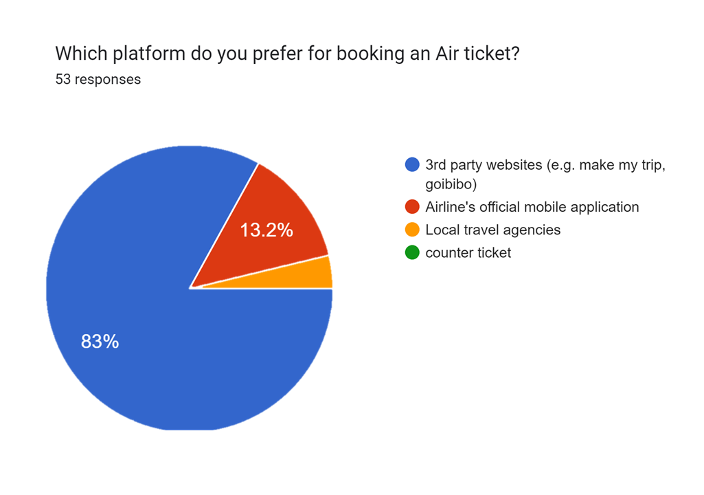
3rd party platforms
3rd party booking platforms are mostly preferred because of better rate comparisons and offers.
Insight: Ability of comparisons between various options helps building user’s confidence while taking any decision.
Provisional personas
With the insights from market research, and user survey we started to generate provisional personas which represents the potential user groups.
These personas will guide us while screening participants for usability testing and Interviews.
Frequent flier
- Abrupt Planner
- Time Sensitive
Goals
- Hassle free trip planning.
- Fast services at the airport.
Pains
- Time taking booking process.
- Hidden fares while booking.
- Long queues/ waiting periods at airports.
Needs
- A fast way to book his/her flights.
- Exclusive perks.
Occasional flier
- Unhurried Planner
- Price Sensitive
Goals
- Finding the most economical fight options.
- Getting his/her favorite seat.
- Complete his/her journey without any difficulty.
Pains
- Is not very familiar with the process of booking a flight.
- Feels under confident while traveling.
Needs
- Easy and explanatory booking platform.
- Needs assistance throughout his journey.
Testing usability of existing platform
To deeply understand the challenges users are facing with the current app, we conducted moderated usability testing sessions followed by the user Interviews.
For these sessions, we selected four participants based on the provisional personas.
- TASK 1 - Book a round trip ticket from Air India app one for yourself & one for your family member.
- TASK 2 - Check the status of the flight no AI 805
- TASK 3 - Search a covid-19 travel guidelines, Travel updates.
- TASK 4 -Set reminder for your trips
- TASK 5 -Search about the baggage allowance
- TASK 6 -Find the special offers for domestic flights
- TASK 7 -Find the customer support any of your query
Insights
Too much decision making moments stretches the booking process which leads to negative feedback loop.
All of the participants had difficulty in understanding the economy upgrade option.
No participant bothered to read the long fare descriptions of all three plans , they just continued with the basic economy plan.
All users had different preferences on how the flights results should be displayed.
Asking the users (Interviews)
Right after the usability testing session, we conducted interviews with all 4 participants.
In order to gain insights on their experience with current air India app and to know more about their air travel preferences, we asked following questions:
- Share your ticket booking experience with air India app.
- How do you think it can be improved?
- Tell me about things you liked/ hated in air India app
- How was this different than booking platform you had recently used?
- Tell me about any bad experiences you ever had while planning your air trip?
- Which features/ service you think are must to have in an airlines app and how is it helpful?
- Tell me about any good/ bad experiences you had faced at airport or during any other phase of your air journey?
Responses & observations
We gathered all the observations and statements form all four participants in usability testing and interview sessions .
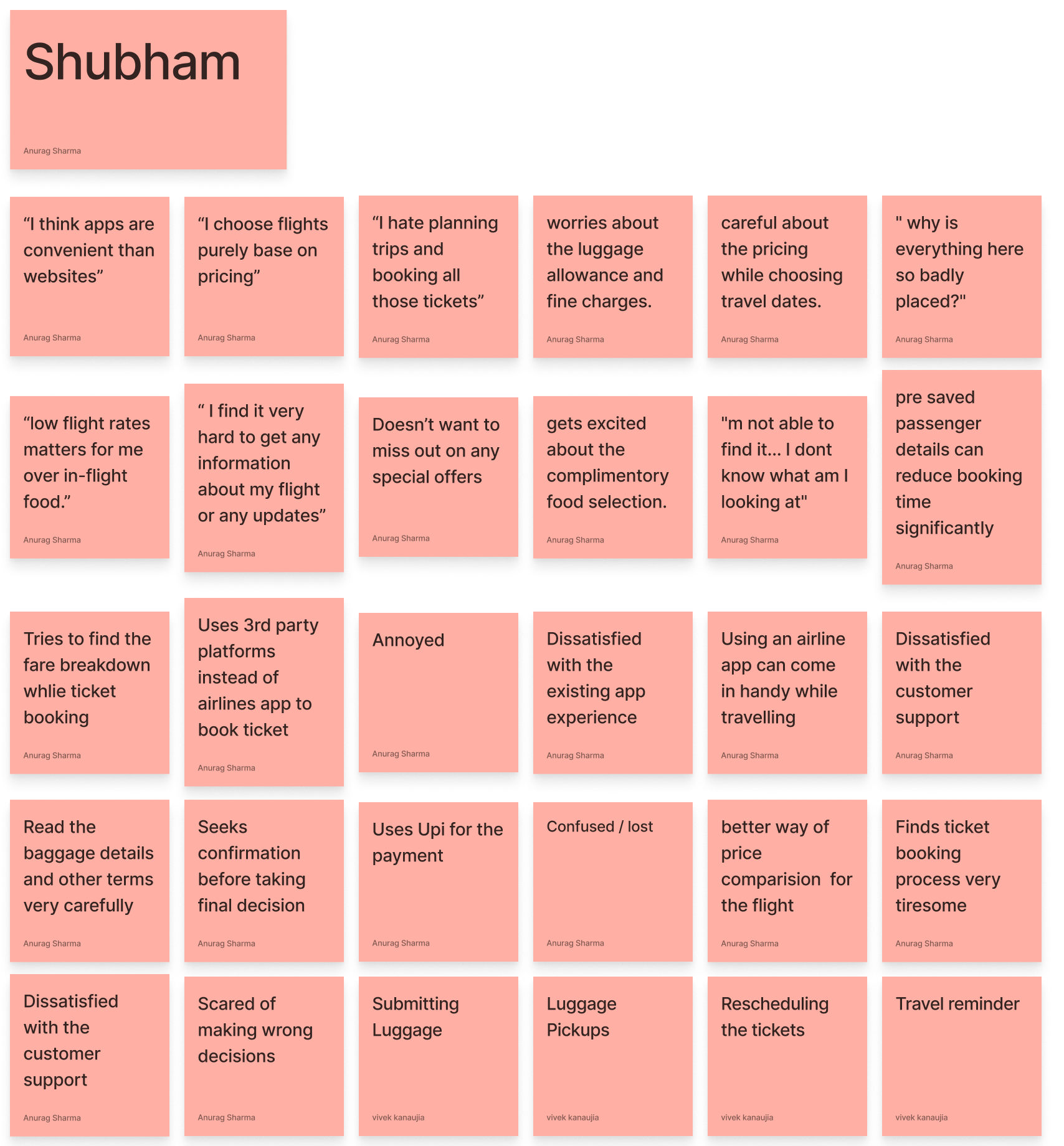
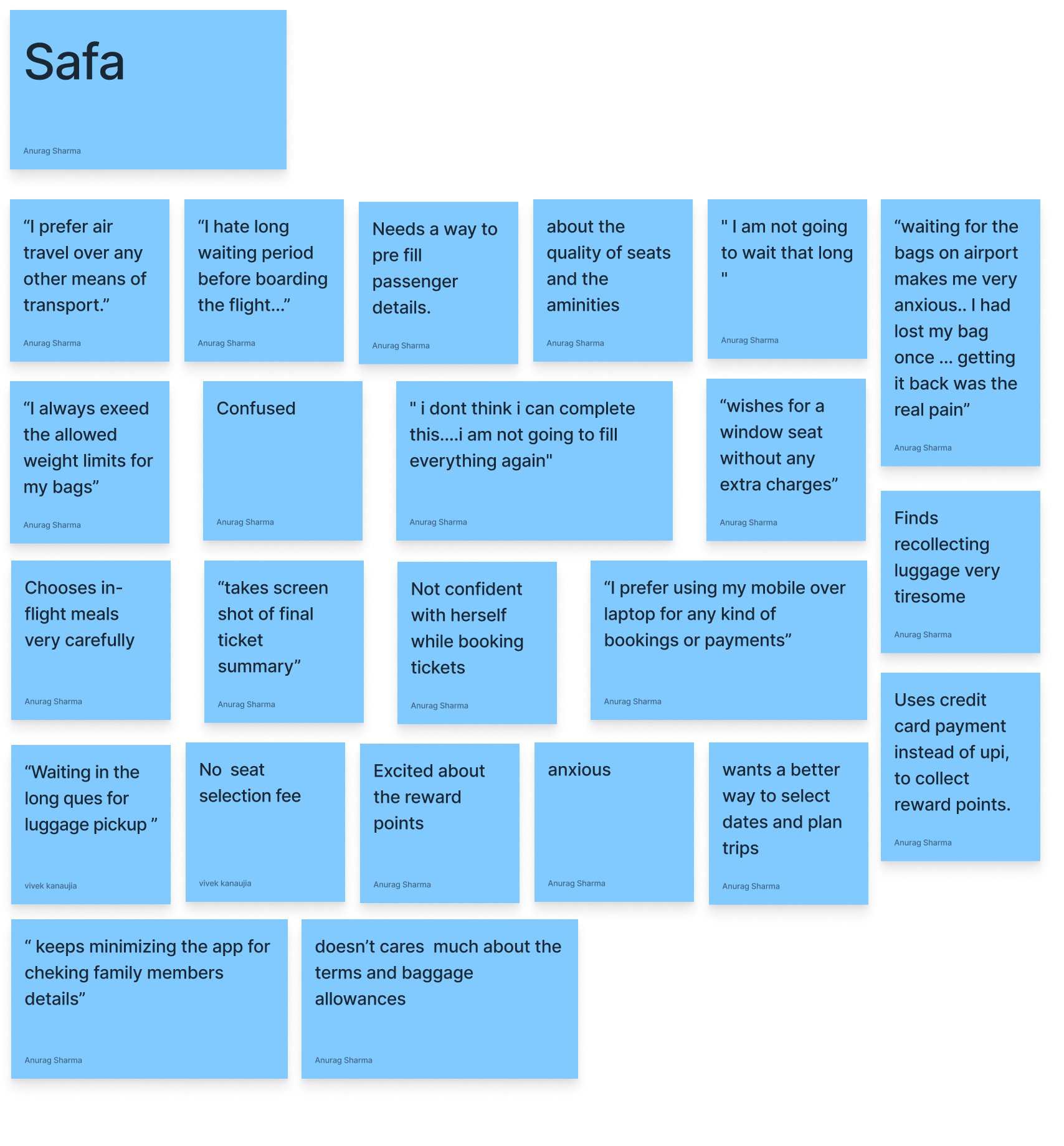
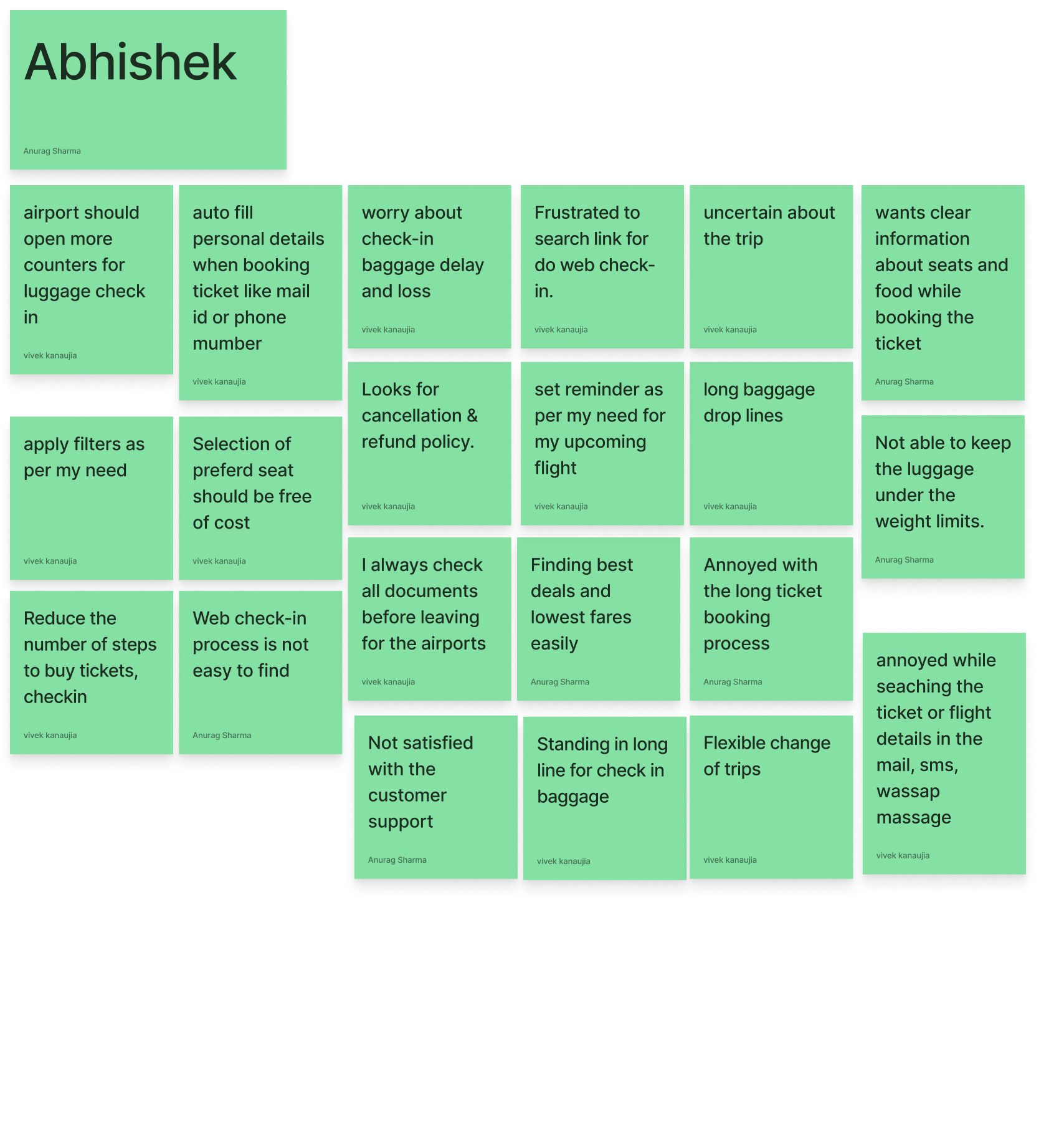
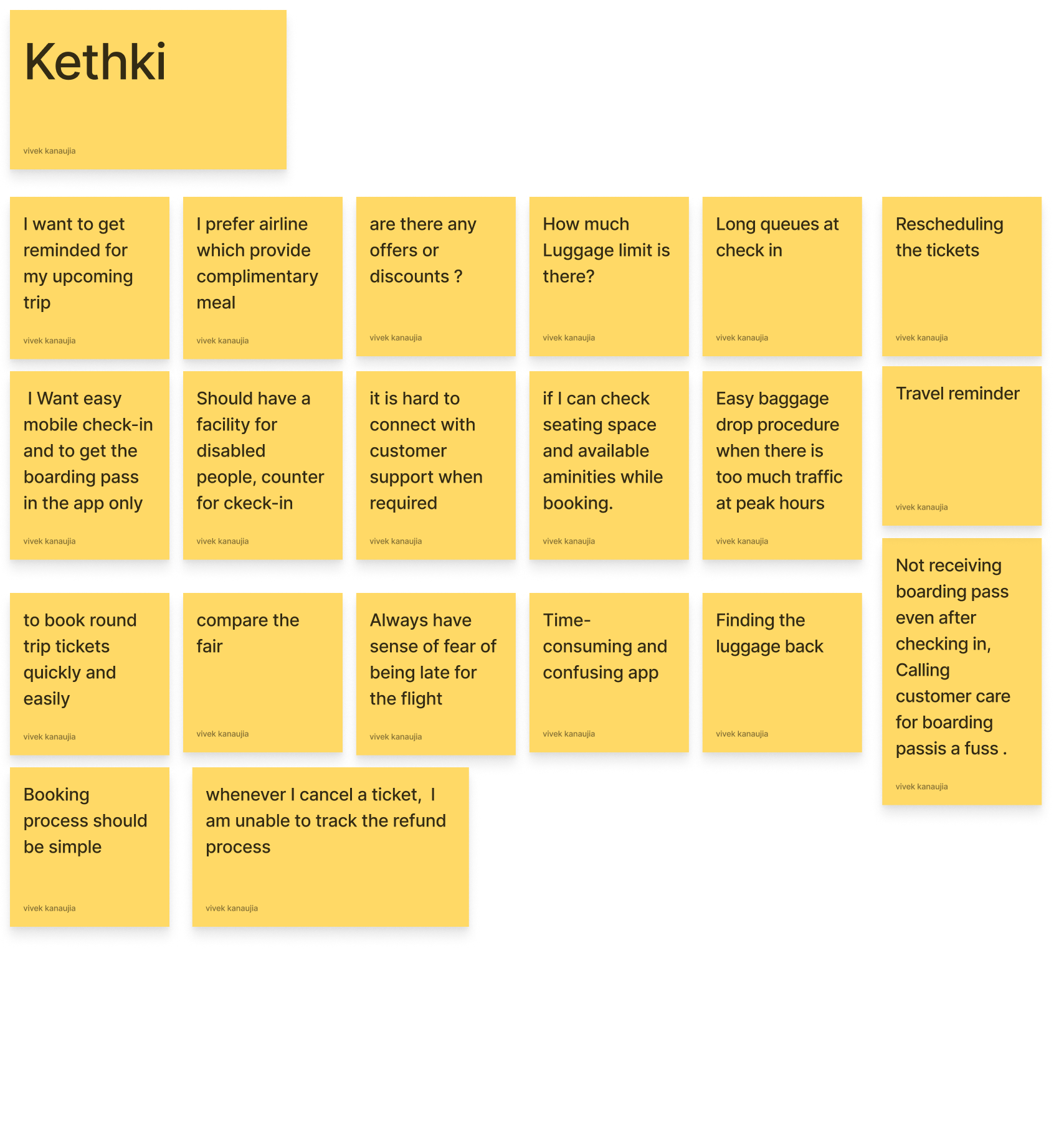
Making sense out of everything (Affinity mapping)
To synthesize all the qualitative data gathered, we organized the information in the form of an affinity diagram to identify patterns across users, uncover insights, and generate needs.
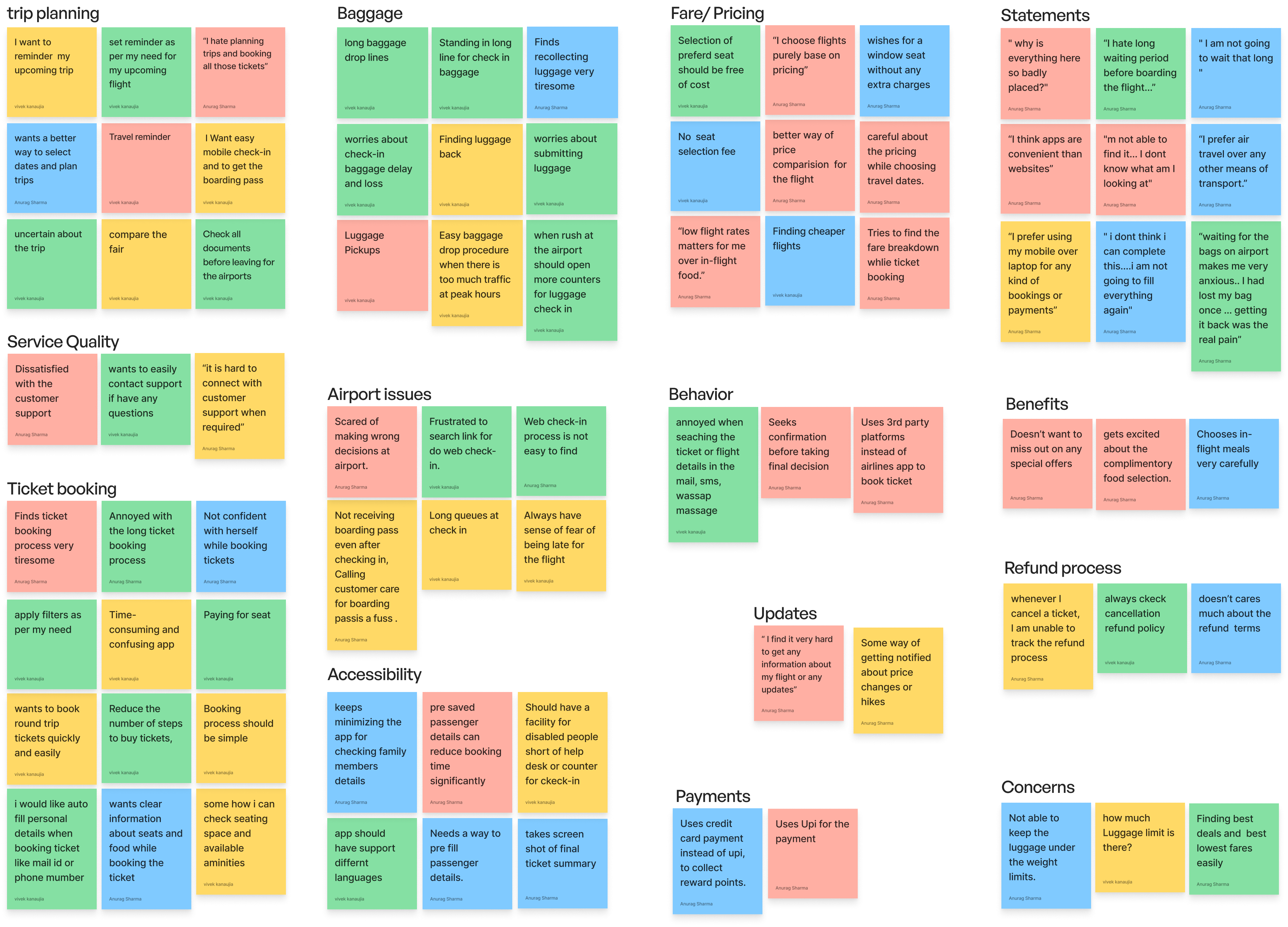
Insights
- Users mostly try to find the cheapest flights while booking.
- Upselling fare options in-between the booking process reduces users confidence.
- Users find it hard to remember all the information because of long booking process .
- Users are concerned about missing out on any important trip related update.
- Most of the users are concerned of not getting proper support/ service when they need it.
- Baggage issue is one of the major concerns for the users.
- Getting refund is a major concern for users after cancellation.
Needs
- User need to find and compare affordable flights.
- Users need fast uninterrupted way to book their flights.
- Users need to get important reminders for any trip related updates.
- Users need to get updated about their baggage related information.
- need an easy way to connect with customer support when I require any kind of assistance.
- Users need a way to known their refund status.
Major findings of the research phase reveled that :
Major challenges which users encounter, stem from different touchpoints along their trip.
To compete with third-party booking sites, the official Air India app must provide additional value/ incentive to the user.
Booking Experience X Travel Experience
User Persona
After we gathered enough information about the users as well as their goals and needs. We created user persona to represent key audience segments.
It will direct our efforts toward addressing the most important problems – to address the major needs of the most important user groups
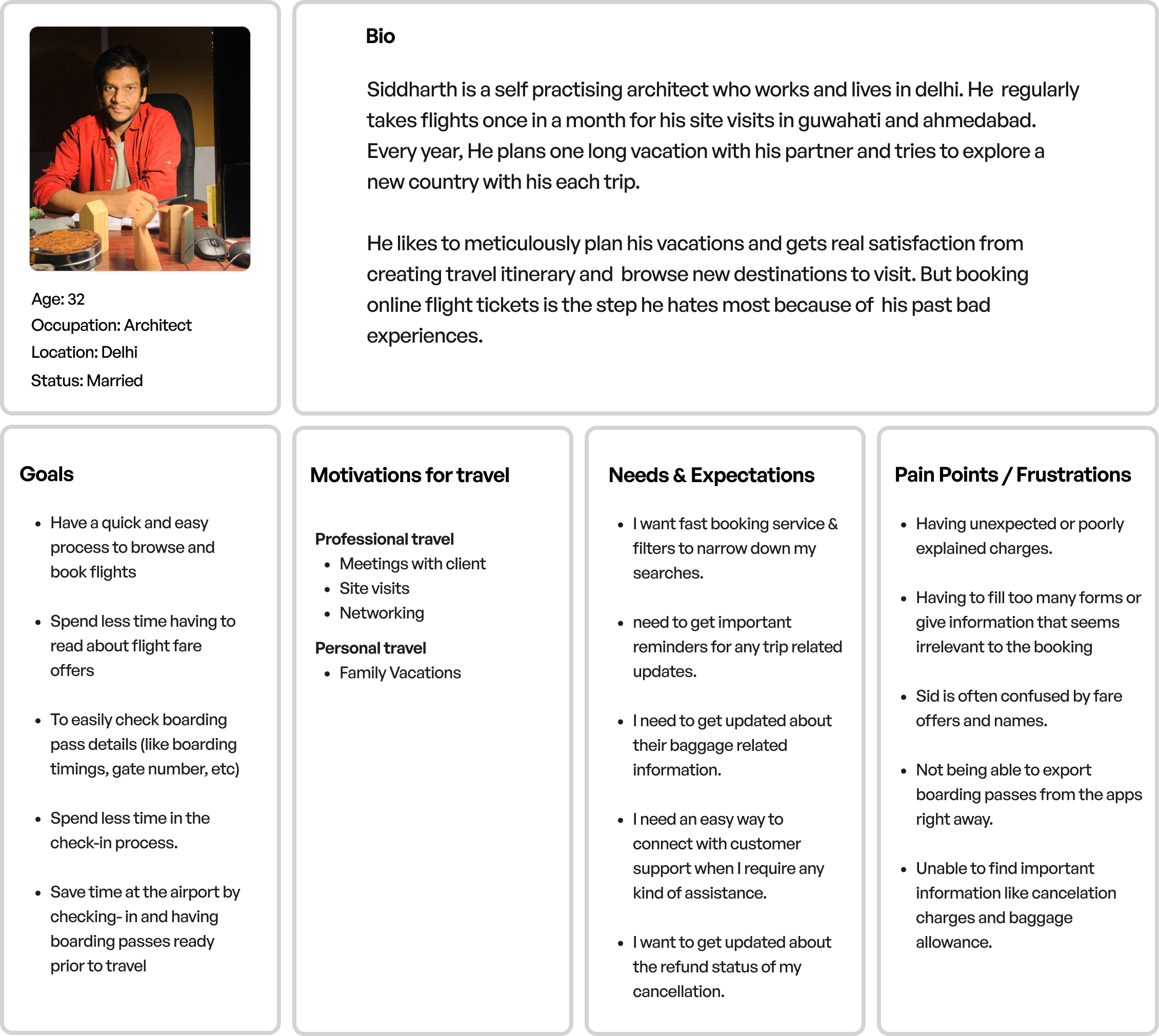
POV Statement
Siddharth is an existing customer of Air India,
Who needs to quickly find the best flights for his vacation because he only finds a limited amount of free time in between other pressing tasks.
Who needs assistance throughout his air travel because he wants a hassle free journey with his family.
How Might We???
We started the ideation phase by framing How-Might-We (HMW) Questions based on the POV statement and the user needs.
We brainstormed on these questions to break them further and to generate possible solution for each of them.
How might we ensure that users can quickly find and book the best flights ?
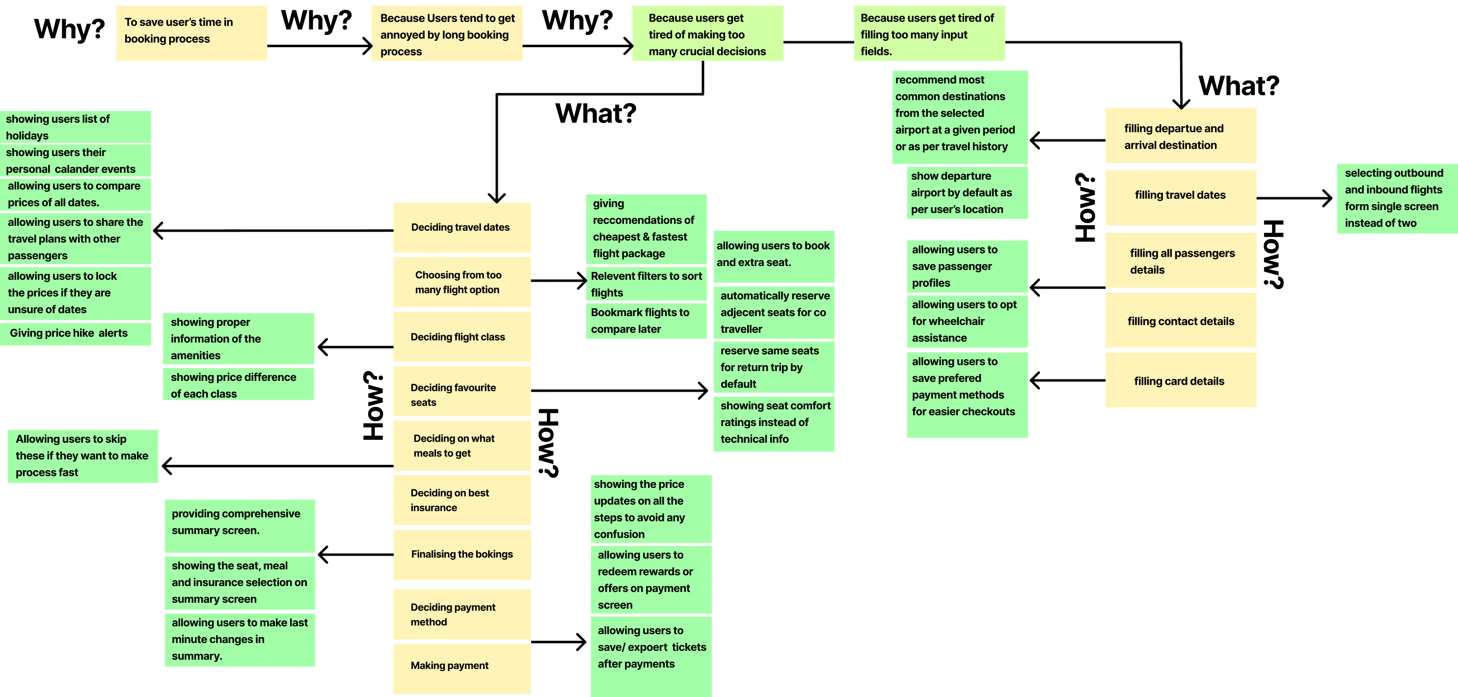
How might we ensure that provide users assistance throughout their air travel?
.png)
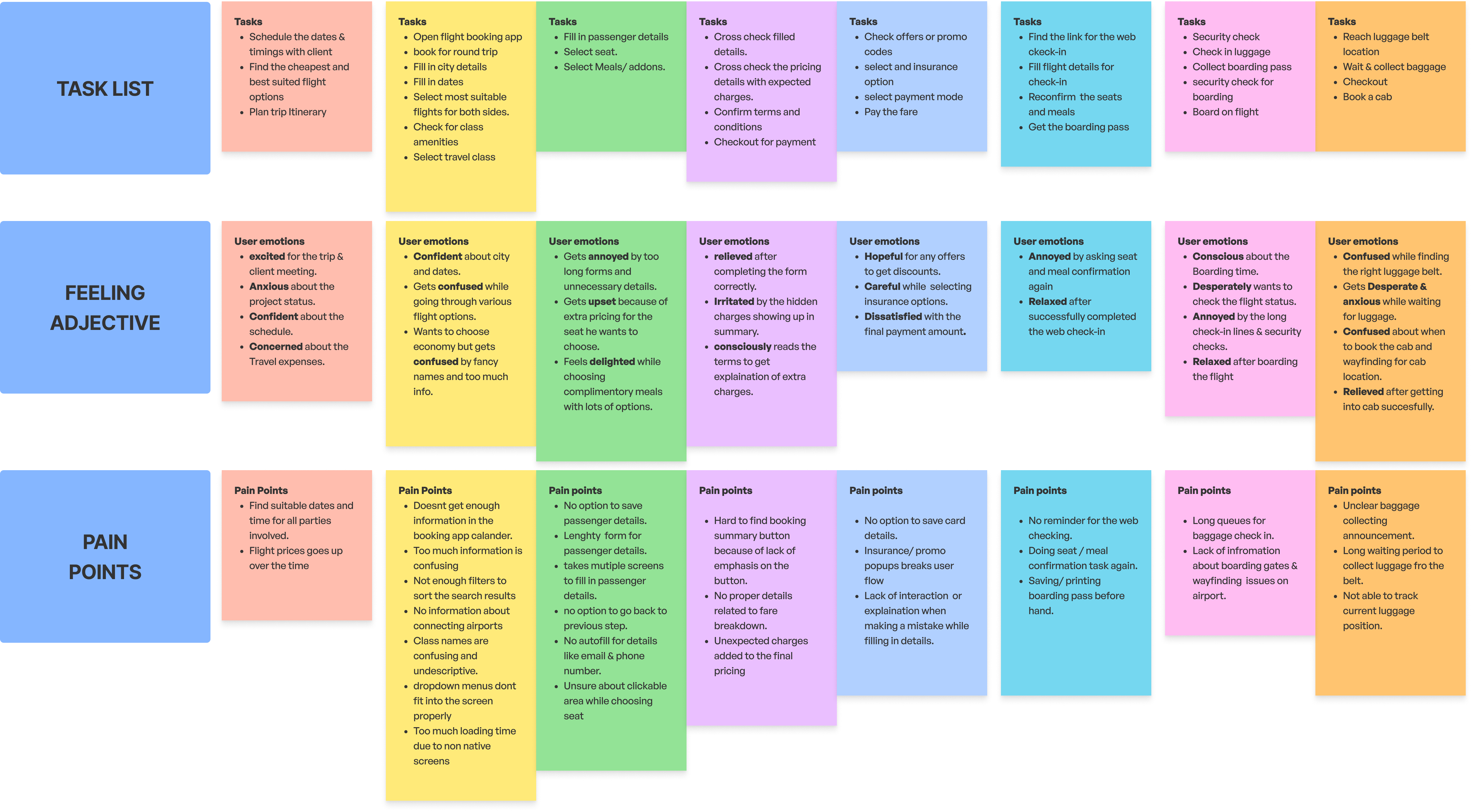
Getting into users shoes (User Journey map)
We started the ideation phase by framing How-Might-We (HMW) Questions based on the POV statement and the user needs.
We brainstormed on these questions to break them further and to generate possible solution for each of them.
Persona : Siddharth
Scenario: Booking flight ticket through Air India mobile app
Expectations :
Smooth booking experience.
Clear information and transparent pricing.
Strong customer support.

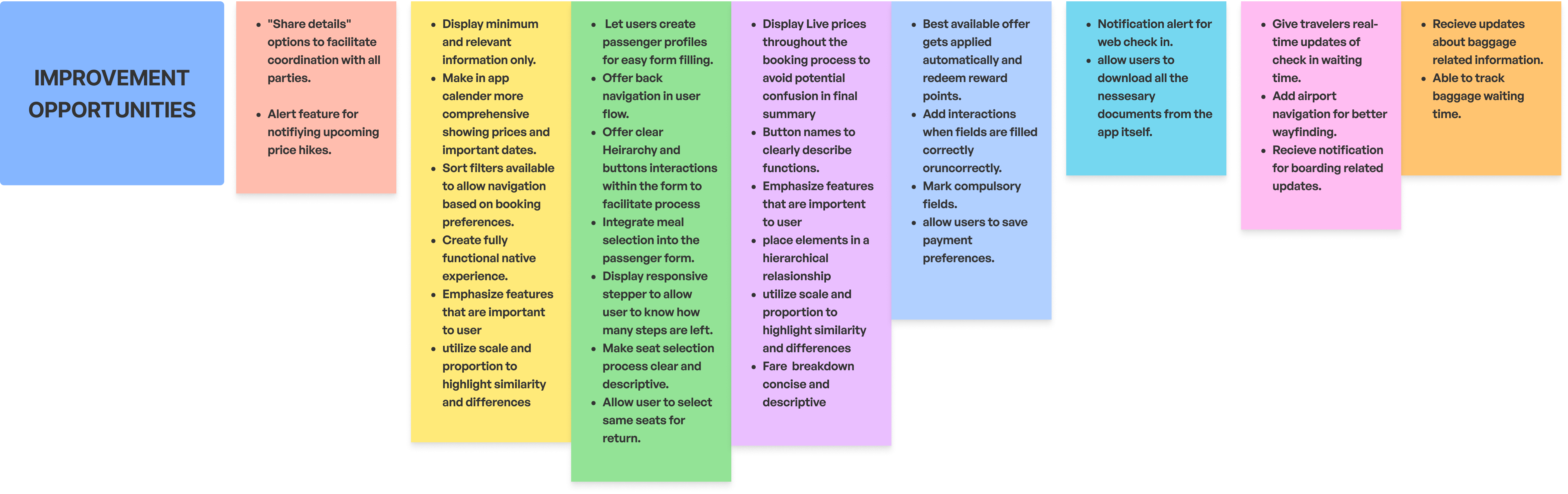
Prioritizing features
We classified the outcomes of our HMW brainstorming session and opportunities derived from User journey map as Must-have (P1), Nice-to-Have (P2), Surprising and Delightful (P3), and Can-Come-Later (P4) features.
The features were sorted according to the amount of value they provide to the user and the amount of effort required to develop them.
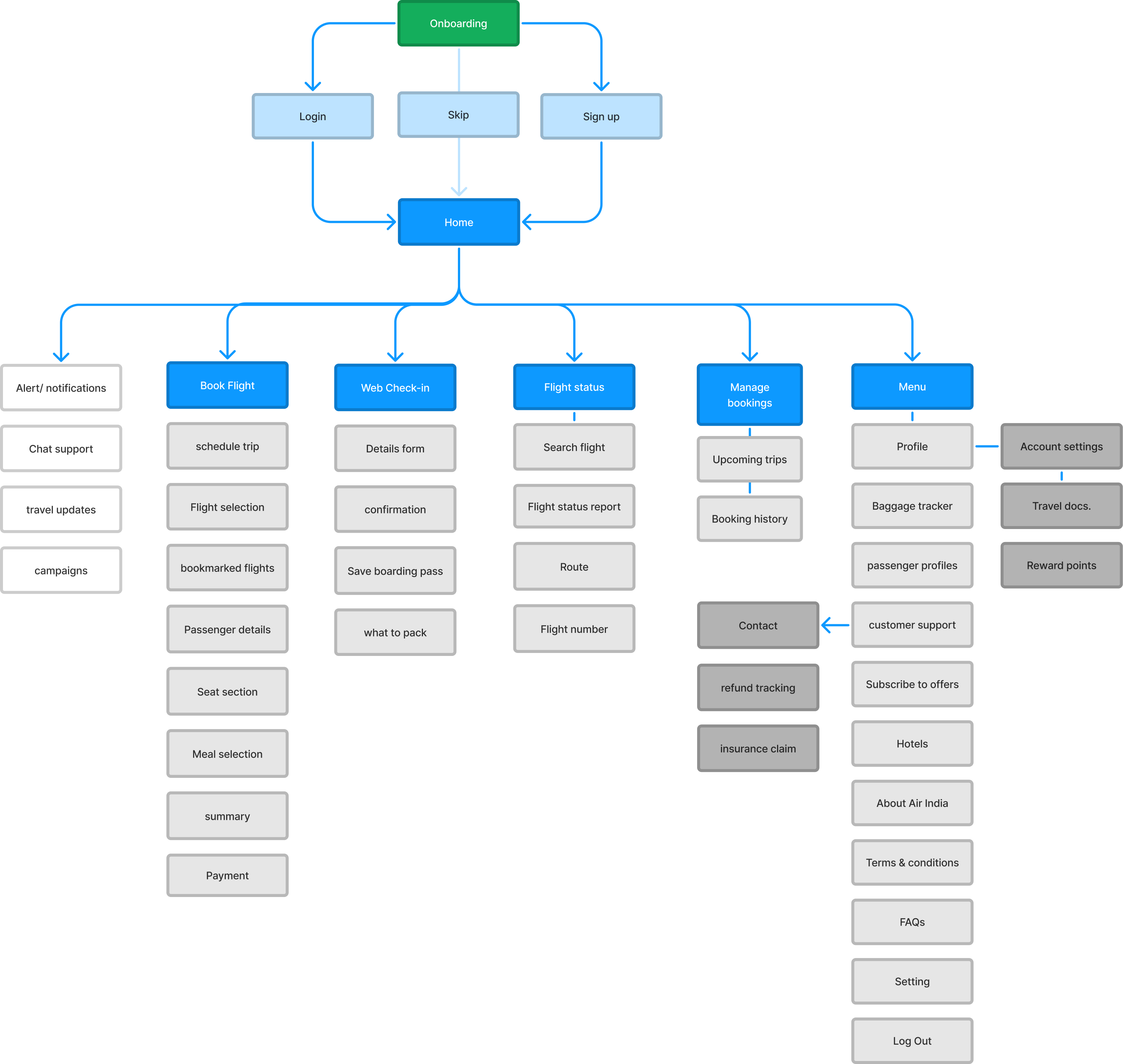
Application map
With the P1 & P2 features finalized, we started organizing and structuring the information for our application.
The goal of this task was to establish relationship between the features and understand the hierarchy of information.
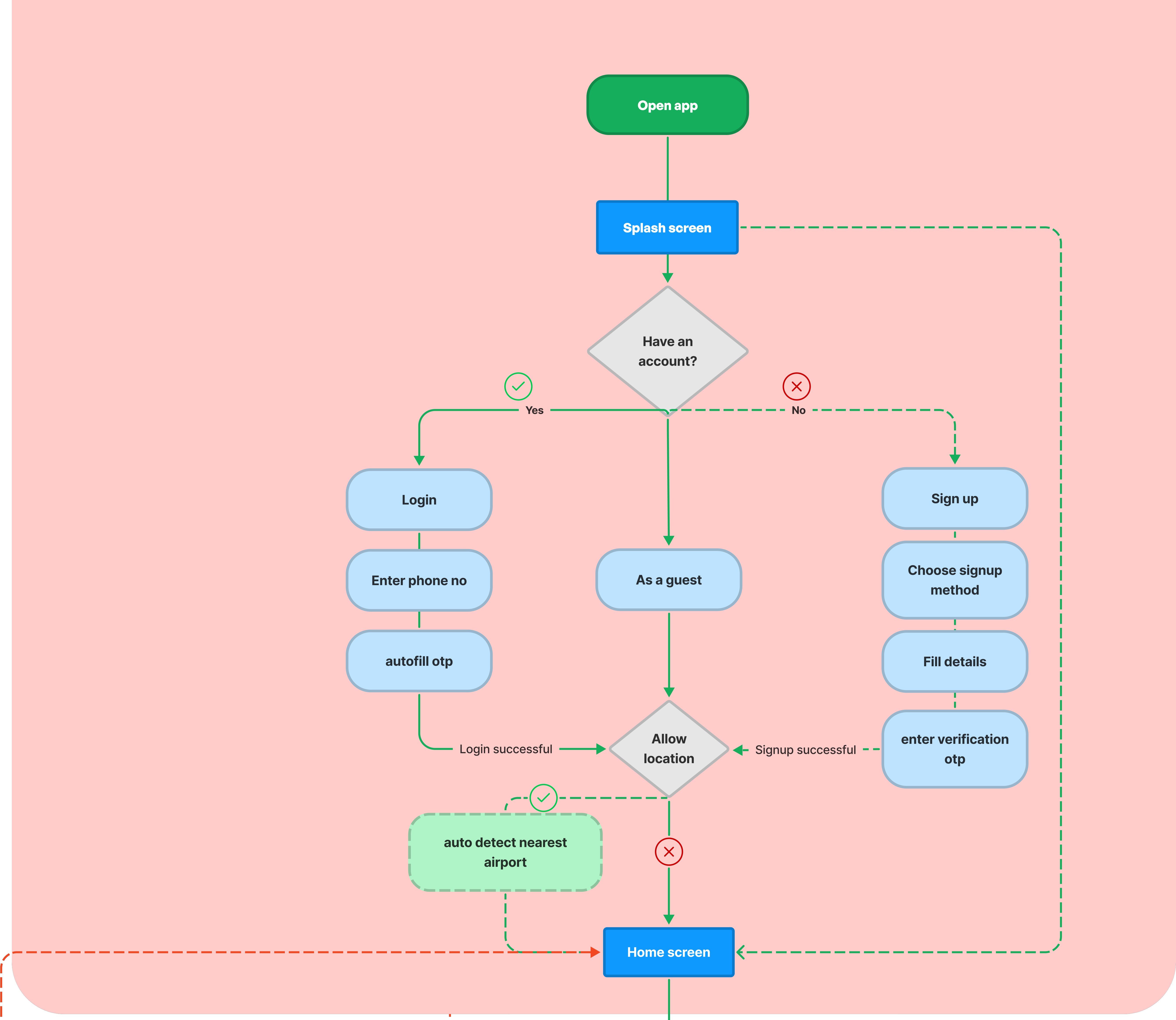
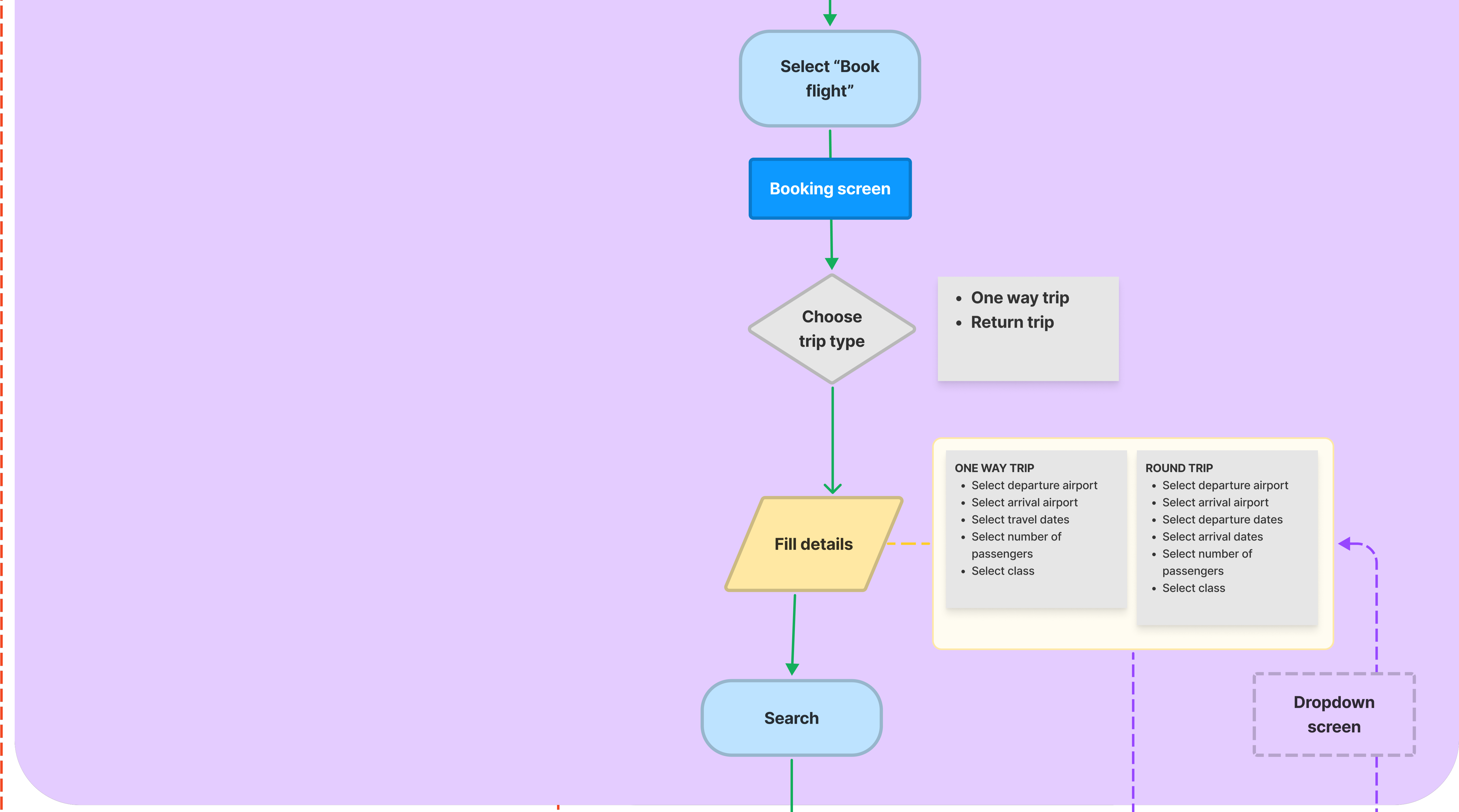
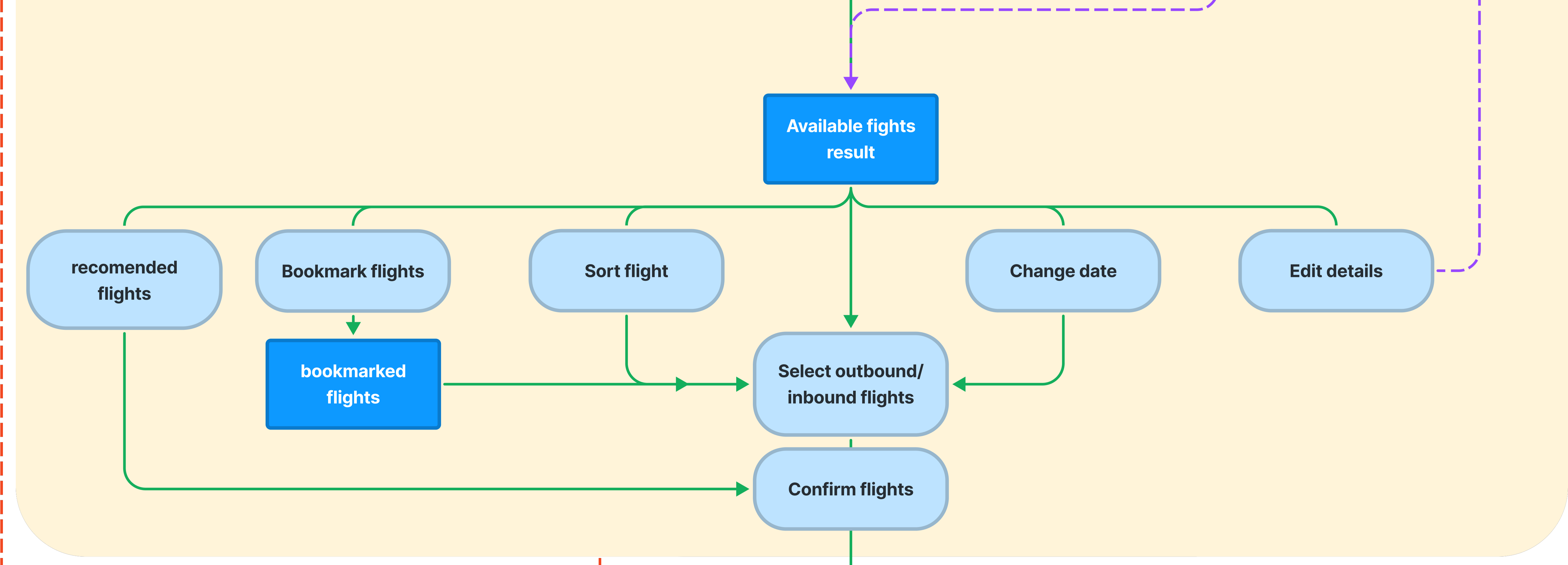
User flows
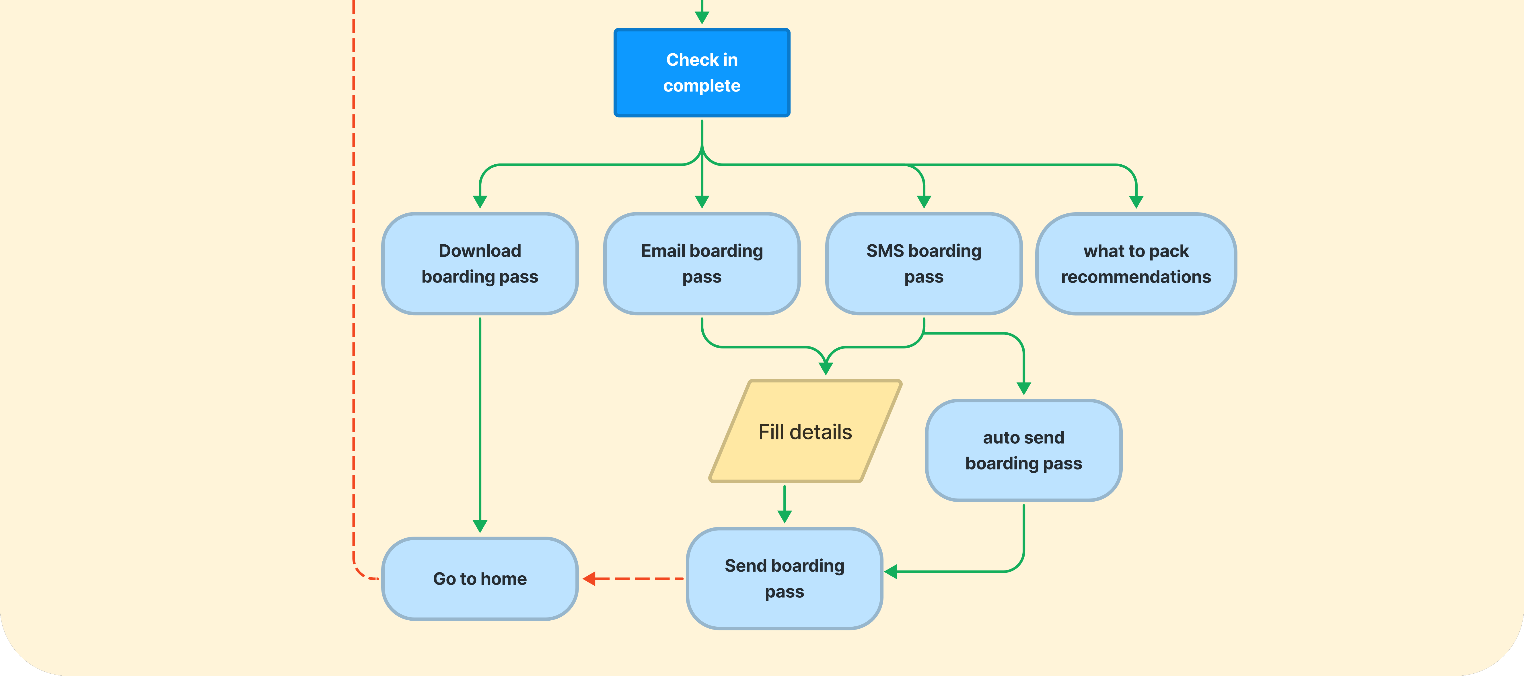
To make it easier for users to navigate through the whole process, We created two user flows which were focused on the main features of our app (ticket booking and check-in).
This allowed us to understand the different paths a user may take in a process flow as well as to identify the critical decision points and actions.
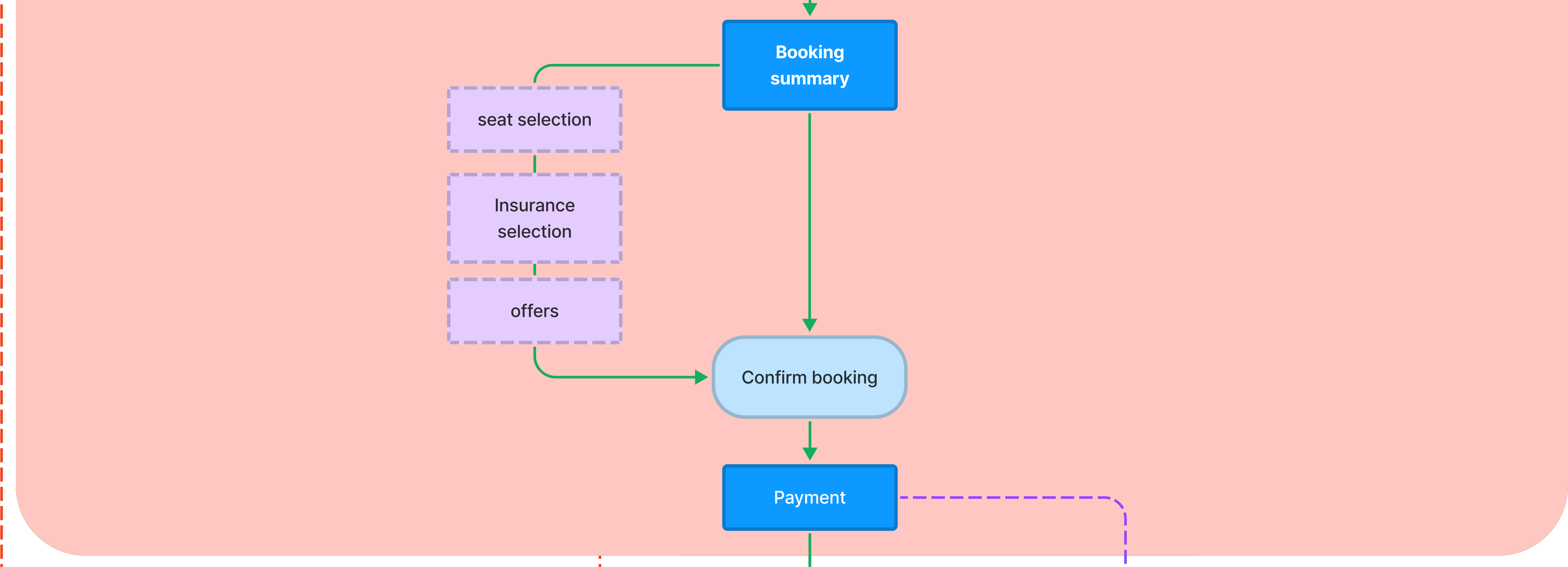
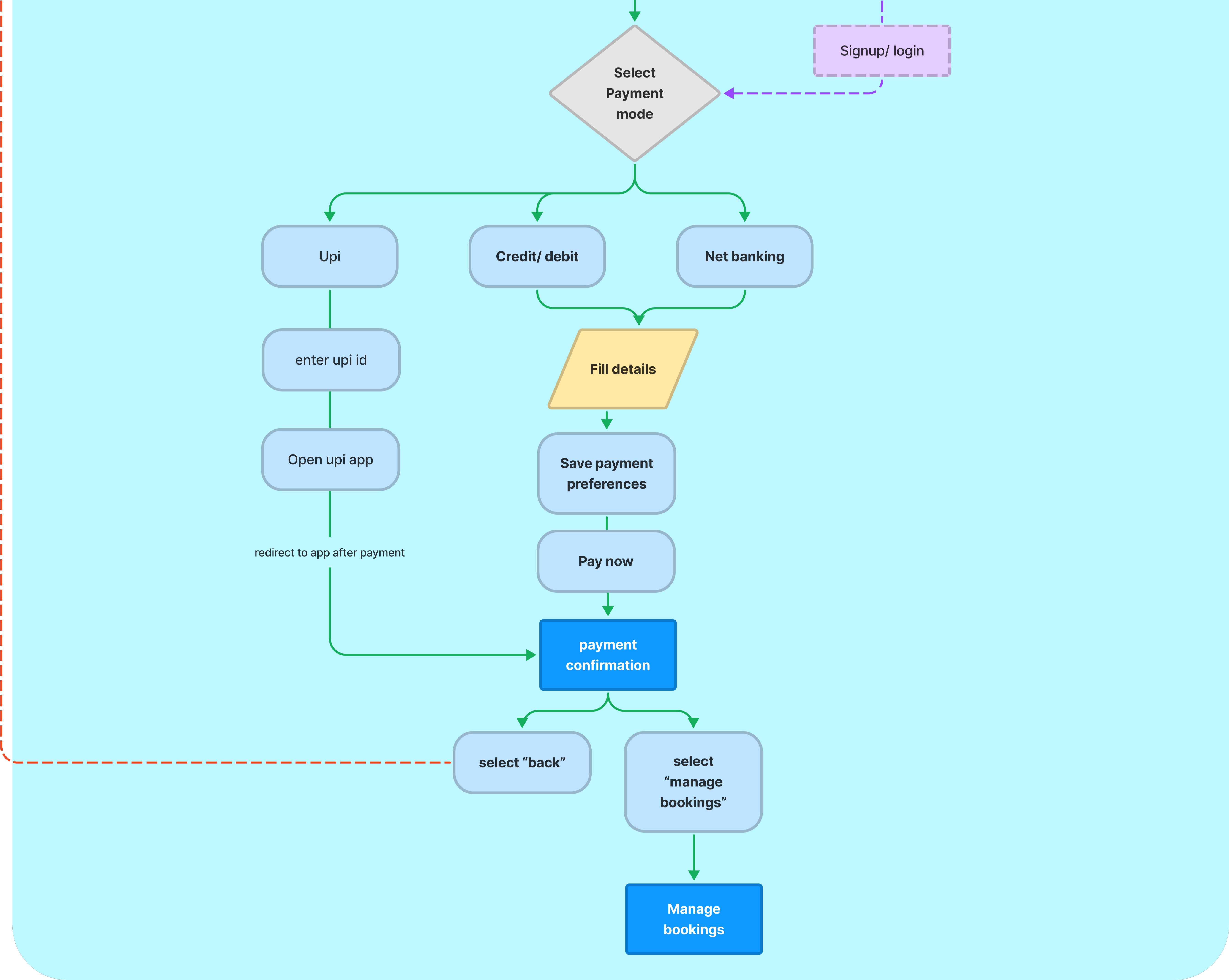
Scenario 01 : Booking a ticket


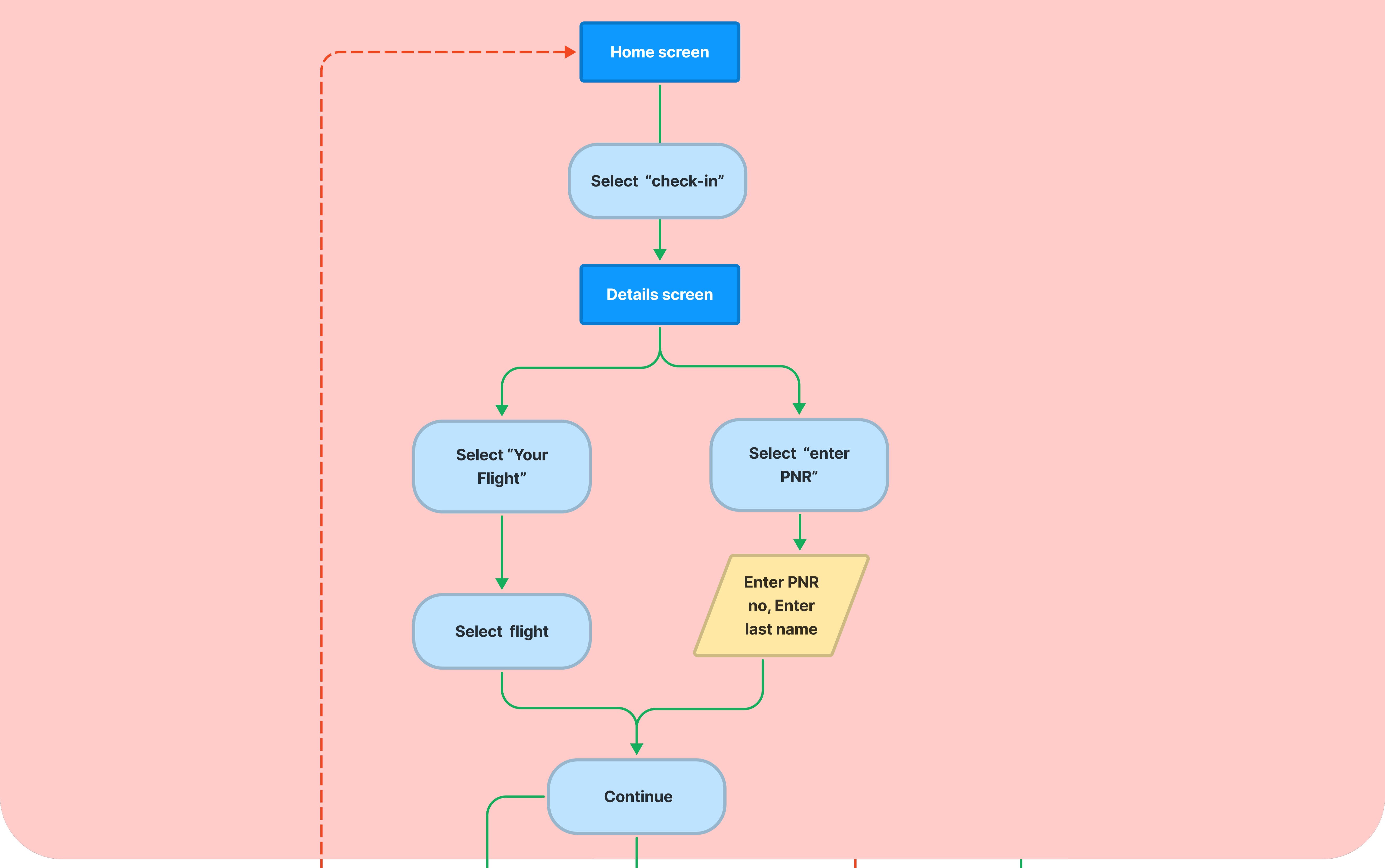
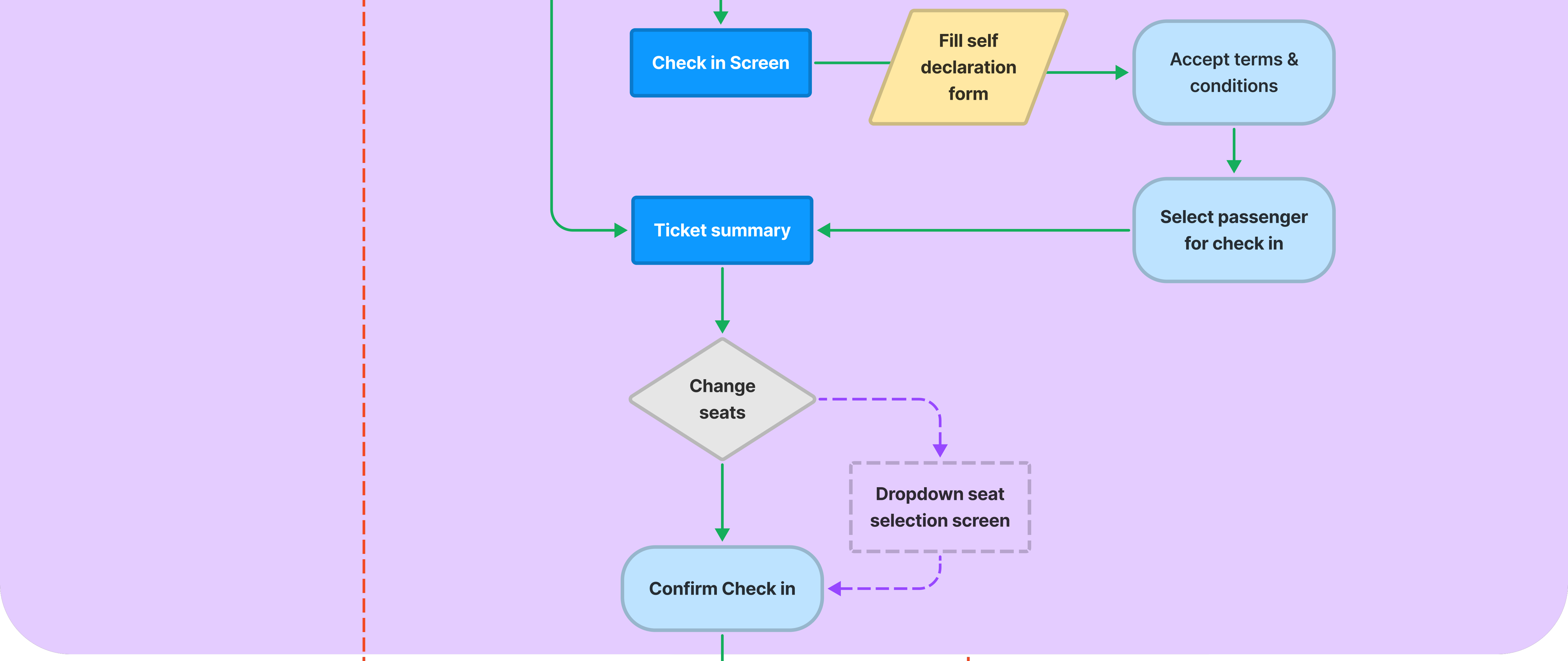
Scenario 02 : Web Check-In


Sketching out the ideas (wireframing)
With the features and user flow defined, we started ideating upon the the layouts for the key screens identified in user flow diagrams.
We worked around the idea of sorting information in the form of "cards" so that each task/ section is clearly defined and easy to navigate.
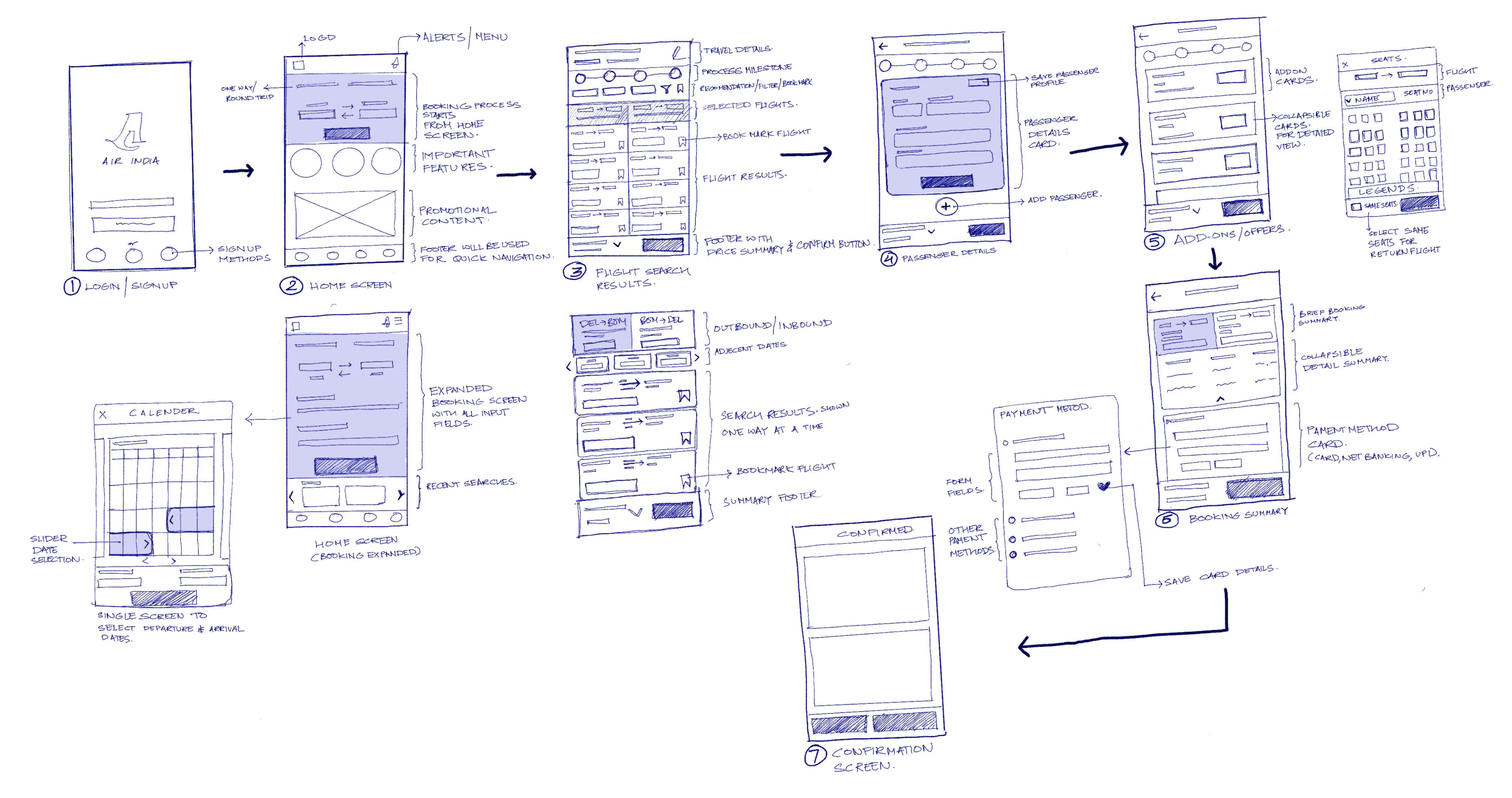
Getting it right early (low-fidelity testing)
After digitizing all the paper wireframes, we conducted moderated testing sessions with four participants to identify usability concerns early in the process.
Based on the feedback we developed iterations for each screen & tested them again with other two participants.


Setting the visual language
To maintain brand recognition, we picked the existing brand colors for the primary theme of our app.
We also compiled UI elements and font guidelines as a library to re-use them as components and have a consistent visual language across all screens.
.png)
High fidelity prototype
To bring the prototype closer to reality, we created high-fidelity wireframes in accordance with the specified style guide.
It enables us to assess the overall aesthetics and visual balance of the app.
Home screen
Users can start the booking process by providing all the necessary inputs on the home screen itself.
"Recent searches" section stays on the screen while entering the "search flight form".
Users only see the most important task on the screen, and all the promotional collaterals are placed at the bottom to avoid visual hinderance.
.png)
Date selection
Pricing information is shown early in the booking process, as most of the users would want to book the cheapest flights available.
Users can select dates for inbound and outbound flight from the same screen which eliminates repetition of tasks in single flow.
Important dates of each month are indicated as it enables users to take decisions quickly .
Months and year can be manually selected instead of just swipe action, as users may want to book the flight months prior to their trip.

Search results
A milestone stepper is added on the top to indicate the completed steps to the users.
Cheapest and the fastest recommendations are shown first, most users would want to select the cheapest or fastest flight.
Users can "lock price" of any fight for a week by paying certain amount. As most users are unsure about their trip while booking their flights in advance.
"Fare upgrade" options have been removed from the search results screen to reduce the no. of decisions on single screen.
Users can bookmark each flight to compare them later.
Outbound and inbound flights can be selected from the same screen to reduce repetitive tasks.

Add passenger
Each passenger form is represented by a card. Which makes it easier for the users to navigate.
Users can save the passenger details to use auto fill for future bookings, as most users feel annoyed by the long inputs in every session.
Wheelchair preference for each passenger can be added and saved for the future trips.
Form shows mandatory and optional fields to let users decide which info they want to share.

Addons screen & seat selection
All the extra services which can affect the fare are separately shown as addons. Users have the freedom to skip this screen to make the booking step considerably shorter.
The seat selection screen shows the part of the plane where the seat will be located. This helps users to relate with layout while selecting the seats.
Users can book same seats for the return flight. This reduces input efforts, making the process easier.

Summary and payment screen
Flight summary is integrated with the payment screen as user can review their trip related fare on the payment screens itself.
Detailed fare breakdown can be seen by expanding the flight summary card.
Users are able to save their preferred payment method to make future transactions easier.

Confirmation
Tickets are separated trip wise which makes it scannable for the users.
Users can easily download or share the tickets from the confirmation screen.

Interactive prototype
Final thoughts
With the completion of the final prototype, I believe we have met the objectives set forth for the project from the start. We have tried to identify and solve the most of usability issues in the present state of the app. We have also proposed the features which can add value to the app and can help users in making their whole air travel experience smoother.
Learnings
- Taking the waterfall approach for this design problem had made our process longer. An agile method would have been preferable, with the first prototype created during the early phases and subsequently iterated with research insights and feedback.
- With this case study , I also learnt the value of adapting the approach to the situation and making critical judgments at the appropriate moment.
Next steps
- Conducting more in-depth usability testing sessions to further improve the booking flow.
- Addition P3 and P4 features which helps shaping the whole travel experience and provides users incentive to use the official app.
- Addition of more accessibility features like regional languages, voice assistance.


